Companion Article: Deriving Maximum Branding Benefit from an Email Signature Program.
There are three approaches typically taken to creating an email signature:
- Create it in Microsoft Word, and then copy it from there.
- Create it directly in your email program’s signature editor.
- Create it from scratch using HTML coding.
If you’re looking for a full-featured email signature, it’s only the third approach that’s likely to yield a robust, standardized, and understandable result.
Having worked at this full-time for 16 years, I’ve got a good sense of the limitations, problems and solutions pertaining to HTML email signatures. There are four aspects to deploying an email signature program, all of which are of considerable importance - these are:
- Design / layout.
- The use of graphics and the HTML coding.
- Installation of the signature and the configuration of your email program.
- Educating end-users regarding the performance of the email signature.
This article is organized around these four topics. Within each, I’ll share the most important considerations as well as obscure tips and tricks that can easily solve vexing problems. Ideally you will have:
- Decent understanding of HTML programming;
- Basic ability to manipulate graphics;
- Access to a server that you can post to.
Finally, before diving in, it is important to note that this is a moving target. Things change, often without you knowing it. What works today may not work tomorrow. What was once a brilliant idea may be transformed into a fatal flaw by a single decision by Microsoft, Google, or Apple. It keeps things interesting!
Table of Contents
- Design, Layout and Content Considerations
- HTML Email Signature Coding
- Sample HTML Email Signature Code
- Email Signature Installation Approaches
- Email Signature Use Issues
- Gallery of Example Email Signatures
Part 1 - Business Email Signature Design, Layout and Content Considerations
Begin by Recalibrating Expectations
A great business email signature would:
- have visual pizzazz or classic styling;
- contain a wealth of pertinent information & hyperlinks without being overwhelming;
- while always functioning flawlessly.
Note that I said “would” and not “does.” Having dedicated myself to designing and developing email signatures for the past 14 years, I can state with authority that the above is not possible. With that out of the way, let’s start over.
A good business email signature is:
- visually appealing and reinforces branding;
- achieves a happy medium in terms of content & hyperlinks;
- functions as well as is possible and fails gracefully.
We’ve already made an important first step in the email signature design process - we’ve recalibrated expectations. Why is this necessary?
First of all, it just seems intuitive that creating a great email signature would be simple. Webpages can look beautiful and work flawlessly, even while incorporating complicated and diverse content. So an email signature, which is usually no more than contact information, a logo, and a few links, should pose no problem at all. Not true. We’ll come back to why shortly.
The second reason it’s necessary to begin by recalibrating expectations is that virtually everyone has received a beautifully designed email signature - an email signature that worked perfectly. Jumping to the (erroneous) conclusion that what they see is what everyone sees, this “perfect” email signature then sets the standard for the one they want for themselves.

The Problem is Easily Explained
Webpages display reliably because the only thing between the point of origin (the HTML code) and the destination (the webpage) is a browser. Displaying the webpage is the browser’s primary job, so it facilitates this simple transaction between author and reader almost perfectly.
Email is technically identical to a webpage - that is, it’s simply some HTML code that gets translated (by an email “client” program, not a browser) into something a person can read.
However, its “life” is frequently much more complicated than that of a webpage. It begins simply enough, the user composing a message using their email program (Outlook, iPhone, Gmail, etc.). The formatting of an email message, and signature, almost always starts out perfect. The next step though, is that it’s received by someone who:
- may be using a computer or may be using a phone;
- may receive email in Outlook, Gmail, iOS, Android, Yahoo, BlackBerry or something else;
- may have image blocking turned on (and if so, may or may not choose to display the images);
- may convert all received email into plain text.
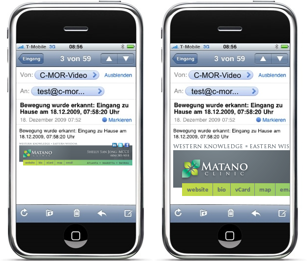
They then may reply or forward. In so doing, the settings and capabilities of whatever email program / device they are using apply to the whole message, not just to the new content they’ve added. The whole message includes the original email signature. Depending upon the combination of the above listed factors, the email signature may survive intact or may degrade (fail) in various ways. The following chart shows some of the most common situations:
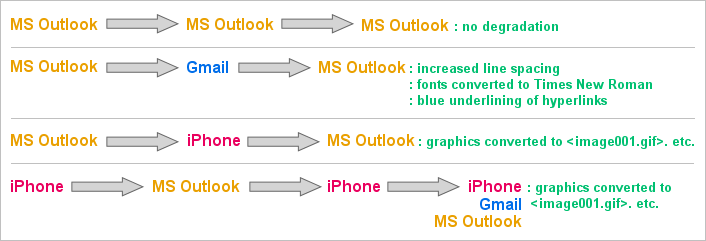
Understanding that failure will occur along these lines is key to the next step in effective email signature design, the compromise.

The Compromise
Given that email signatures do not work as well as we’d like, we need to settle for something less than perfect. The spectrum of choices ranges from brief text to graphically rich signatures loaded with hyperlinks. As is true of most things in life, a happy medium lies somewhere in- between.
As I’ve observed over the years, when the proper happy-medium is achieved, users settle in comfortably. Identifying where on the spectrum this happy-medium lies takes experience, good honest communications with the customer, and occasionally some trial and error.

As a rule-of-thumb, professionals (attorneys, CPA’s, engineers, etc.) tend left of center of the spectrum shown above, while sales people (real estate, mortgage lenders, insurance), tend further to the right.
There is no right or wrong. With the signature on the left, Emily will experience a high degree of reliability. Almost every time she sees her signature, including in email threads that have gone back and forth a bunch of times, her signature’s going to look about the same. Any anxiety Emily feels in regards to her signature is likely to come when she is exposed to a full-featured, graphically rich, signature and is left to wonder if she’s missing something.
On the other hand, if Emily’s using the signature on the right, she’s likely to frequently see this:

This experience can create the opposite type of anxiety - leaving her wondering if maybe she hasn’t gotten too fancy and is now creating an unprofessional impression.
Over the years I’ve created all types of signatures for people, helped people move back and forth across this spectrum, and watched as they finally get settled and comfortable with a signature that is always a bit less than perfect.
Note: For a person like Emily, using the signature shown above with all of the ‘s, it’s critical for her to understand that the person she emailed most likely saw the signature as intended. Only when that person clicked REPLY did things get messed up. This is the truth, and is also a very important point in helping new users get comfortable with the performance of their signatures.

Achieving the Compromise - Your Toolkit
Because of the likelihood that the user (your customer) will not have an in-depth grasp of the issues surrounding the use of their email signature, one of your jobs as a designer is to guide them down the most prudent path during the design phase. Where they may see nothing but colorful images, precision alignment, and numerous hyperlinks, you may be seeing ahead to the pending headache of explaining to them why it’s not working exactly as they wanted it to.
From a reliability standpoint, your primary enemy is graphics. Lesser enemies are hyperlinks and text strings that can wrap badly.
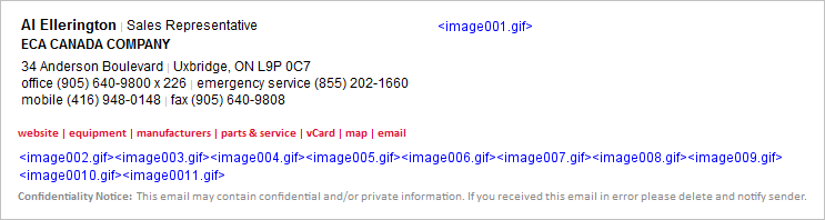
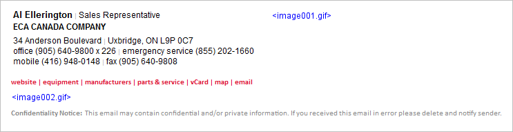
Dialing back on the use of graphics can, at times, be accomplished with minimal impact on the visual quality of the signature. Here’s a recent situation I dealt with. The full design the client specified was:

Each of the little logos in the row at the bottom was individually hyperlinked, all going to a specific manufacturer page on the ECA website. When this email signature traveled from MS Outlook to iPhones and back, the result was:
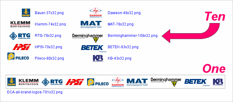
Responding to the customer concern, I improved this by grouping the ten logo graphics into one graphic:
Following this improvement, the resulting degraded signature appeared as:
As you can see, the failure above is more gracefully presented than the one with eleven ‘s. In this case I was able to link to a manufacturer’s page which was a jumping off point for all ten of the individual manufacturers, so we lost nothing visually and very little functionally, making this a good step towards the happy medium for this user.
To illustrate a different approach, let’s return to the Recruiters International signature for Emily Fitzpatrick. As you recall, she had eight social media (type) icons at the bottom of her signature:

As a result of all the graphics (logo and many icons), her signature looked as follows after making the roundtrip from Outlook through an iPhone and back:
In this case, we were able to clean it up significantly by changing the icons to text. The look of the intact signature then became:

As a result of this adjustment, her signature now looked as follows after making the roundtrip from Outlook through an iPhone and back:

Now, this may or may not have been the happy medium for Emily - it really depends upon how wedded she was to those social media icons. At least I was able to offer her options, allowing her to be the final arbiter.

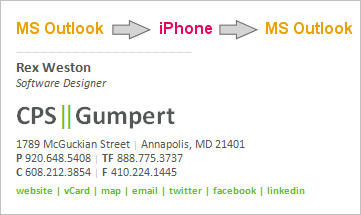
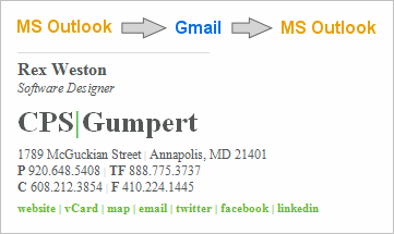
Next let’s take this drive towards greater reliability a step further. Sometimes it’s possible to create a good reproduction of a company’s logo by using stylized HTML text. Here’s an example of a signature I designed recently that had four graphics - the company logo and three social media icons:
![]()
After this was put in use, the customer indicated that a few users were experiencing a considerable degree of consternation over the behavior of the graphics, and would it be possible to reconstruct the signature with no graphics at all. The resulting text-only signature was:

At this point we have a signature that is going to present minimal changes as it travels from email program to email program.
Back-and-forth between MS Outlook and iPhone / iPad results in no degradation.
Gmail changes the font styling to Times New Roman and collapses the two vertical green bars into one.
Note on Line Spacing (Leading): Many normal HTML styling tricks are unavailable to you when designing email signatures. One of these is an ability to reliably create reduced line heights. As a result, a reliable text-based recreation of a stacked logo that utilizes tight leading is not possible.

In this section I’ve covered the process of stepping backwards across the performance / design spectrum. Understanding the tools that are at your disposal, and the gains and sacrifices made by various choices, puts you in a better position to commence the design phase of your project - the goal being to present the customer with a design that satisfies them when first seen, and then continues to satisfy them when in actual use.
Forward Looking Design & Layout
One trap that’s important to avoid is the creation of a design that cannot handle abnormally long strings of text. This is most common when it comes to titles. You may anticipate a title such as “Vice President of Administration” but not be prepared for “Senior Manager of Workplace Automation and Production Controls”. The graphic below is an illustration of a design concept that could suffer from this problem.

Sometimes the most practical solution is to deal with the handful of anomalies (long names or titles) on a custom basis, in the case above perhaps manually widening the design in the few cases where it’s necessary.
Email Signature Design & Layout in the Age of Smartphones
Prior to smartphones, email signatures wanted to be horizontal. The goal was to allow them to be seen fully even when an email message wasn’t opened on a computer, but instead was viewed in the preview pane. It was safe to assume that we had at least 650 pixels in width to work with. Now, and undoubtedly into the future, email signatures want to be vertical - smartphones offer limited viewing area and an overly wide email signature can lead to any of the three following problems:
- Message recipients have to scroll left and right to read the body of an email.
- The email signature is scaled down to fit the window, and as a result the font size of the email’s body is also scaled down, making the message difficult or impossible to read.
- The text in the email signature wraps in unpredictable ways, messing up the signature’s layout.
The degree to which you must compromise in terms of layout and design can be significant. Having been doing this for 16 years, I will state unequivocally, “Always compromise towards robust performance!” No matter how nice your visual aesthetics may be, if you or your users are left with a nagging doubt about their email signature every time the SEND button is clicked, then you’ve failed as a designer.
Let’s look at the problems in detail. First and foremost is text wrapping. A linear presentation of phone numbers and addresses is often preferable from a design standpoint:
1800 East Washington Avenue, New Lisbon, WI 53303 Tel: (608) 233-3100 | Mobile: (608) 845-8333 | Fax: (608) 233-3199
However, the wrapping on a smartphone may cause this to be displayed as:
1800 East Washington Avenue, New Lisbon, WI 53303 Tel: (608) 233-3100 | Mobile: (608) 845-8333 | Fax: (608) 233-3199
It’s useful to note that expectations seem to be low for the display of signatures on smartphones - most people recognize that the screens are small with the result being that perfect formatting may suffer. However, if the above wrapping proves to be unacceptable to the customer, the obvious solution is to move to a stacked design:
1800 East Washington Avenue New Lisbon, WI 53303 Tel: (608) 233-3100 Mobile: (608) 845-8333 Fax: (608) 233-3199
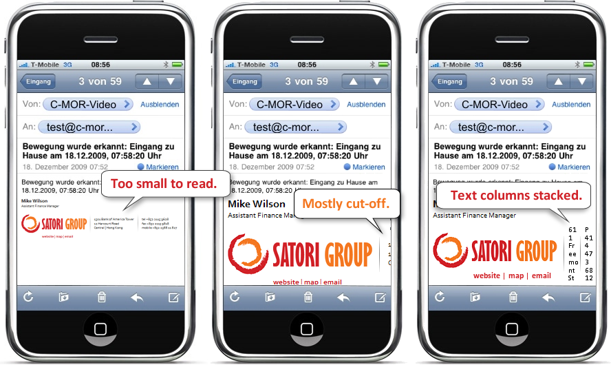
It is also important to think about the width of any graphics you may use, and if overly wide, how they may translate to display on a smartphone. Below is a graphically based signature design I did for a customer a number of years ago.

There are two ways, both bad, that this may be displayed on a smartphone. As seen on the left below, it can be scaled down to fit the window. In this case, the text in the signature becomes completely unreadable, making it impossible to even read the sender’s name. (I have seen cases where the message text itself is also shrunk at the same proportion as the signature graphic, making the entire message unreadable). The illustration on the right shows the alternative condition - the signature graphic is displayed full size, cutting off the vast majority of it.
In designing email signatures these days we must assume that they will be received on smartphones. As a result it is important to do your best to keep graphics to a reasonable width (a 300px maximum is a good rule-of-thumb).
It’s also important to remember how table layouts can limit available display space on smartphones. From a design standpoint, I tend to favor what I call a “side-by-side” design when confronted with a square, round, or vertically oriented logo. However, this layout is a poor choice when a logo is horizontal in its orientation. Here’s an example:
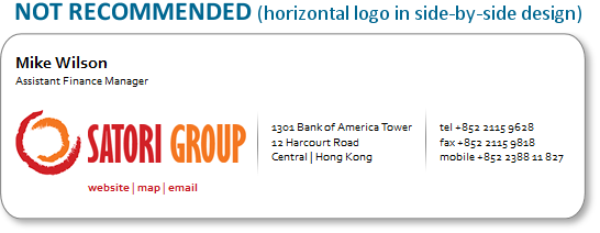
This is an attractive design and it’s easy to understand why the designer and the client decided to move forward with it. However, by our rules, the use of a horizontally oriented logo in a side-by-side design is clearly a mistake. Why? Because of the way it will be displayed on a smartphone:
For text & logo business email signatures, the “stacked” design (example shown below) is always the best option, with a “side-by-side” design making sense for some logo shapes (square, round, or vertical).
Although this can feel very limiting, I’ve found that it’s almost always possible to find a compromise design that the customer is comfortable with. Sometimes, unfortunately, this is a multi-step process, as it’s often the case that customers only become truly aware of the technical limitations once they put their email signature into actual day-to-day use.
Content Considerations
There’s a great deal that’s been written about what content belongs in an email signature, and what doesn’t. Although I’ve designed literally thousands of signatures, I don’t have a strong opinion as to what should be included - I think that the content decision is very customer specific. That said, here are a few experience-based observations:
Photos: Realtors & Mortgage Loan Officers often like photos of themselves:

Links to Bio Pages: Whenever bio pages for individuals are included on a website - attorneys almost always - then the email signature should include a hyperlink to the bio page. Email signatures provide a natural feeder into the more detailed bio page, allowing the sender to feel confident that he or she is sharing information about themselves in an effective and efficient manner.
Taglines: In some cases the addition of a company tagline is desired - I usually add them at the bottom of the signature, using a colored font if appropriate, such as I did here with the “We Build Trust, Teams & Integrity”

Page-Specific Hyperlinks: Some customers have very specific items on their website that they want to call people’s attention to. If this is the case, it may be appropriate to add these as page-specific links in the email signature itself, as we did here with “see a demo”, “buyer’s guide” and resource center”.

User Optional Content: One of the things that can make email signature design a challenge is the variations between users. Some may want to include their mobile phone number, some may prefer not to use their title, some may work out of a home office and hence not want to include a physical address, etc. Furthermore, email signatures are quite personal. The more latitude you give to users to customize their signature (within set boundaries) the more likely your program roll-out and adoption process will go smoothly. I often make social media links optional, always make mobile phone numbers optional, and sometimes make other data elements like a toll free number, a tagline, or page-specific hyperlinks optional.
Conclusion
Here’s how I approach virtually every new email signature project:
- Present the customer with a middle-of-the-road design that I feel confident will work well.
- At the same time I present this to them I inform them that it will not work perfectly, and let them know about some of the problems they can expect. I usually do this by directing them to our FAQ’s - email-signature-user-faqs.html. My feeling is that three things are accomplished by the simultaneous presentation of a design and its technical pitfalls - you nip their desire for something even fancier and more elaborate in the bud, you begin lowering their expectations to a reasonable level, and you establish yourself as someone who is going to be honest and straight-forward with them.
- If they don’t abandon the project (or you) at this point, you’re now in a good position to work with them and achieve a good result based on realistic expectations.
The following section will give you the detailed information you need in order to construct sound HTML code for an email signature, and then some helpful strategies for deploying the finished program.
Part 2 - Html Email Signature Coding
Please note that the coding techniques that follow are the result of extensive experimentation and long-term testing. While you may feel as if you can see ways of modifying or improving them, the chances are good that your ideas have already been tested and rejected for one reason or another.
Image Pixelization: While some logos are more susceptible to pixelization than others, it’s always best to display a clean, unpixelized, logo. The graphic below shows a clean and a pixilated version of a logo - the top is the full logo shown actual size and beneath it is a snippet of the logo shown at a 1000% zoom.
![]()
There are three aspects to achieving a good display. First, start with a good high resolution copy of your logo, and then scale it down to the exact size you want to use in your email signature. The final size will vary depending upon your logo and your signature design. As a rule-of-thumb I’d expect a horizontally oriented logo, such as the Vega Consulting logo shown above, to be 150 to 250 pixels in width. For a square, round, or vertically oriented logo, I’d expect the height to be from 70 to 90 pixels. Make sure you create a scaled down version of your logo that looks clean and sharp.
Next, you’ll want to display your logo at 100% - do not allow the logo to be shown at any other size - it will always look bad if you do. Simply use the height and width settings in your image reference to do this:
Finally, I recommend that you always use GIF or PNG graphics.
Spacing Between Text: As hard as it is to believe, if you’re designing email signatures for use in Microsoft Outlook you may not be able to accomplish this:
Tel: (414) 473-6812 Mobile: (414) 988-3211 Fax: (414) 473-6819
You’re likely to end up with:
Tel: (414) 473-6812 Mobile: (414) 988-3211 Fax: (414) 473-6819
The natural programming inclination is to simply string together a series of non-breakable spaces - - to achieve the spacing you want. Micorsoft Word, Outlook’s editor, will strip out all but the first of these  ’s (note: the use of   won’t help). You’ll be left with just one, and hence your signature will render as:
Tel: (414) 473-6812 Mobile: (414) 988-3211 Fax: (414) 473-6819
One solution is to insert a white or transparent spacer graphic in between the text you wish to separate. This will work fine, but carries two potential drawbacks - some potential increase in your SPAM score and more graphics showing up as attachments when that happens (and it will at times).
The solution I prefer is to use a pipe (vertical line symbol) to create the desired separation:
| Tel: (414) 473-6812 | Mobile: (414) 988-3211 | Fax: (414) 473-6819 |
This has proven reliable and from a design standpoint seems to be generally acceptable to most graphic designers and marketing people. I usually set the font color to a light gray for these pipes:
| Tel: (414) 473-6812 | Mobile: (414) 988-3211 | Fax: (414) 473-6819 |
Avoid White Fonts: The above discussion of creating visual separation may lead you to the idea of simply making the separator pipes render in white, thus disappearing visually. That works, but setting font colors to white (or even something else that’s super light) can be a SPAM trigger. It’s not a risk worth taking.
Avoid Special Characters: I’ve experimented with the use of ampersand#9632; to create solid squares as separators between text. Although this works nicely, I’ve encountered many instances of email messages being sent to SPAM folders as a result of this character triggering a “Russian Character Set.” As a result, I’ve learned to be very prudent about my use of any special characters in email signatures I design.
Spacing Between Lines: The best approach I’ve found is to make frequent use of table rows and then to set the top and bottom padding as needed:
This approach to controlling line spacing works quite reliably.
Note of Caution: I do not recommend using a reduced line-height parameter to tighten up the spacing between actual lines of text that will appear in the signature - some smartphones will display those lines of text as overlapping, one partially on top of another.
Horizontal & Vertical Spacing - Another Strategy: Another approach to spacing is padding images with white space. You can create precise and reliable spacing around images - left, right, top or bottom - simply by padding the image with white space. You should never hesitate to use this technique if it can help you.
Images as Attachments: No one wants their email signature to result in attachments. Unless you’re willing to skip the inclusion of your logo graphic, precluding attachments 100% of the time cannot be achieved.
There are, however, two things that you can do at the HTML programming level to help. First is to minimize the number of graphics you use. Your logo, and social media icons probably have to be graphics. In most cases, there shouldn’t be any other graphics included in an email signature.
Secondly, there’s an old, undocumented, attribute - NOSEND - that works in some cases to prevent images appearing as attachments. I’ve used this since 1999, and during the few occasions where I’ve removed it I’ve had increased reports from my clients of images being attached. I’ve never found any downside to it, and so continue to use it in every image reference as follows:
Note: For a deeper explanation of “images as attachments” please refer to these two FAQ’s:
Sometimes my signature appears as an attachment
I’m confused by how images work, and don’t work, in signatures.
Don’t Use Image Mapping: Image mapping used to be a great way of incorporating multiple hyperlinks in a single graphic in an email signature. It works well with everything I’m aware of except for Outlook 2010. If you will have users installing signatures into Outlook 2010, image mapping built into their email signature will not work. (It can seem like it works, but it doesn’t - don’t be fooled!)
Use full URL’s in Hyperlinks: Some of the smartphone platforms require the full URL, always including the www, in order for a link to properly open the page in the browser when clicked.
Don’t use TinyURL’s or goo.gl’s: The use of TinyURL’s (including Google’s goo.gl’s and bitly links) can increase the likelihood of your email winding up in a SPAM folder.
Font Sizing: For the best reliability across devices and email programs, use point size (PT) rather than pixels (PX) to set your font sizes.
CSS Styling: All CSS styling must be done inline. While this seems inefficient and creates rather messy looking code, it’s the only way of ensuring that your styling will work.
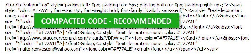
Compacting Your Code: White space & carriage returns that you may use to write clean HTML code that can be easy to interpret can have an adverse effect on your rendered HTML email signature. I suggest working with clean code while creating and debugging your signature, but then compacting it by stripping excess white space and carriage returns prior to putting it into use.
Conclusion - HTML Email Signature Coding: Reliably testing email signatures is very difficult and time consuming. The hidden and unexpected traps are many, and they often don’t expose themselves easily or quickly. Starting from a solid base of knowledge & experience helps significantly in arriving at a good result in an efficient manner. If you’ll follow the advice presented here, and work from the sample code provided, you’ll be well on your way to creating a reliable, high-performing, email signature.
Part 3 - Sample Html Email Signature Code (for the “Vital Design” signature shown below)
|
Rex Weston Software Designer |
|
|
|
155 Fleet Street | Second Floor
| Portsmouth, NH 03801 tel (920) 648-5408 | mobile (920) 988-3854 fax (920) 648-5409 |
| website | newsletter | vCard | map | email |
|
|
| Confidentiality Note: This email may contain confidential and/or private information. If you received this email in error please delete and notify sender. |
Here’s the code, uncompacted for easier reading.
<html>
  <head>
    <meta http-equiv="Content-Type" content="text/html; charset=utf-8" />
  </head>

  <body>
    <table cellspacing="0" cellpadding="0" border="0">
      <tbody>
        <tr>
          <td
            valign="top"
            style="padding-left: 0px; padding-top: 0px; padding-bottom: 0px; padding-right: 0px;"
          >
            <span
              style="text-align: left; color: #000000; font-family: 'Arial', sans-serif; font-size: 10pt; font-weight: bold"
              >Rex Weston</span
            ><br />
            <span
              style="text-align: left; margin-top: 0px; margin-bottom: 0px; color: #000000; font-family: 'Arial', sans-serif; font-weight: normal; font-size: 9pt;"
              >Software Designer</span
            ><br />
          </td>
        </tr>

        <tr>
          <td
            valign="top"
            style="padding-left: 0px; padding-top: 7px; padding-bottom: 4px; padding-right: 0px;"
          >
            <a href="http://www.vtldesign.com/"
              ><img
                src="/assets/img/VitalDesign-logo-148x26.gif"
                nosend="1"
                border="0"
                width="148"
                height="26"
                alt="Vital Design"
                title="Vital Design, LLC"
            /></a>
          </td>
        </tr>

        <tr>
          <td
            valign="top"
            style="padding-left: 0px; padding-top: 0px; padding-bottom: 0px; padding-right: 0px;"
          >
            <span
              style="text-align: left; color: #000000; font-family: Arial; font-size: 9pt; font-style: normal; font-weight: normal;"
              >155 Fleet Street <font size="1" color="#B9B9B9">|</font> Second
              Floor <font size="1" color="#B9B9B9">|</font> Portsmouth, NH
              03801<br />
              tel (920) 648-5408 <font size="1" color="#B9B9B9">|</font> mobile
              (920) 988-3854<br />fax (920) 648-5409<br />
            </span>
          </td>
        </tr>

        <tr>
          <td
            valign="top"
            style="padding-left: 0px; padding-top: 5px; padding-bottom: 0px; padding-right: 0px;"
          >
            <span
              style="text-align: left; margin-top: 0px; color: #F77A1E; font-size: 8pt; font-weight: bold; font-family: 'Calibri', sans-serif;"
            >
              <a
                style="text-decoration: none; color: #F77A1E"
                href="http://www.vtldesign.com/"
                ><font color="#F77A1E">website</font></a
              >
              <font size="1" color="#F77A1E">|</font>
              <a
                style="text-decoration: none; color: #F77A1E"
                href="http://www.vtldesign.com/vital-newletter.html"
                ><font color="#F77A1E">newsletter</font></a
              >
              <font size="1" color="#F77A1E">|</font>
              <a
                style="text-decoration: none; color: #F77A1E"
                href="/assets/files/VitalDesign-RexWeston.vcf"
                ><font color="#F77A1E">vCard</font></a
              >
              <font size="1" color="#F77A1E">|</font>
              <a
                style="text-decoration: none; color: #F77A1E"
                href="http://maps.google.com/maps?q=155+Fleet+Street,+Portsmouth,+NH+03801"
                ><font color="#F77A1E">map</font></a
              >
              <font size="1" color="#F77A1E">|</font>
              <a
                style="text-decoration: none; color: #F77A1E"
                href="mailto:rexweston@yahoo.com"
                ><font color="#F77A1E">email</font></a
              >
            </span>
          </td>
        </tr>

        <tr>
          <td
            valign="top"
            style="padding-left: 0px; padding-top: 7px; padding-bottom: 0px; padding-right: 0px;"
          >
            <a href="http://twitter.com/#!/vital_design/"
              ><img
                src="https://stationerycentral.com/SocialMedia/Twitter-21x17-left-BW.gif"
                nosend="1"
                border="0"
                width="21"
                height="17"
                alt="Twitter"/></a
            ><a href="http://www.vtldesign.com/vital-blog/"
              ><img
                src="https://stationerycentral.com/SocialMedia/Blog-21x17-left-BW.gif"
                nosend="1"
                border="0"
                width="21"
                height="17"
                alt="Blog"/></a
            ><a href="http://www.facebook.com/VitalDesign"
              ><img
                src="https://stationerycentral.com/SocialMedia/Facebook-21x17-left-BW.gif"
                nosend="1"
                border="0"
                width="21"
                height="17"
                alt="Facebook"/></a
            ><a href="http://www.linkedin.com/company/205289"
              ><img
                src="https://stationerycentral.com/SocialMedia/LinkedIn-21x17-left-BW.gif"
                nosend="1"
                border="0"
                width="21"
                height="17"
                alt="LinkedIn"/></a
            ><a
              href="https://foursquare.com/v/vital-design/4b0679eef964a52028ec22e3"
              ><img
                src="https://stationerycentral.com/SocialMedia/Foursquare-21x17-left-BW.gif"
                nosend="1"
                border="0"
                width="21"
                height="17"
                alt="Foursquare"/></a
            ><a href="http://pinterest.com/source/vtldesign.com/"
              ><img
                src="https://stationerycentral.com/SocialMedia/Pinterest-21x17-left-BW.gif"
                nosend="1"
                border="0"
                width="21"
                height="17"
                alt="Pinterest"
            /></a>
          </td>
        </tr>

        <tr>
          <td
            valign="top"
            style="padding-left: 0px; padding-top: 8px; padding-bottom: 0px; padding-right: 0px;"
          >
            <span
              style="color: #8A8A8A; font-family: 'Calibri', sans-serif; font-size: 8pt; font-weight: regular;"
              ><b>Confidentiality Note: </b> This email may contain confidential
              and/or private information. If you received this email in error
              please delete and notify sender.</span
            >
          </td>
        </tr>
      </tbody>
    </table>
  </body>

  <style>
    a {
      color: #f77a1e;
    }
  </style>
</html>
Part 4 - Email Signature Installation Approaches
How you install your email signatures can play an important role in how they perform. We provide detailed installation instructions for almost all major email programs from our documentation.
In this section of this article I will point out some of the less obvious issues that you may want or need to consider.
Two ways of installing into Microsoft Outlook (on a PC): The approach I take for almost all email signature installations (except Outlook on a PC) is to:
- Create the signature as HTML;
- Click it open in a browser window;
- Press Ctrl-A to select all;
- Press Ctrl-C to copy;
- Navigate to the signature creation dialog in your email program and PASTE the signature into the edit window.
While you can install an email signature into Microsoft Outlook (on a PC) using this approach, it is NOT recommended as doing so will cause Outlook to treat the signature as if you created it using its built-in editing functions (based in Microsoft Word). The result is that the images in your signature will become embedded in your outgoing messages.
Although being embedded stops them from being blocked by recipients who have “image blocking” turned on, there are three significant downsides to embedded images.
- If you (as the email sender) have your “display setting” (a Windows setting) above 100%, any images in the signature will become inflated in size and blurry as a result.
- Images that are hyperlinked may not be clickable when received on iPhones / iPads.
- When a message is replied to from an iPhone or iPad, the images will be stripped out and replaced with placeholder text like . Additionally, the images will then be included in the email reply as unwanted attachments.
The recommended approach to installing a signature into Microsoft Outlook (on a PC) is as follows:
- Create your signature as HTML (the file extension must be HTM, not HTML)
- Save that file to the folder that contains your signatures - something like: local computer / owner / app data / roaming / Microsoft / signatures /* Set this signature as your default via the regular email signature dialog function in Outlook.
This approach bypasses the use of Outlook’s email signature creation function (meaning that Microsoft Word never effects your code). The result is that images are not embedded in outgoing emails. Rather, they are served from the server location where you have stored and are referencing them. As a result your outgoing email will behave in a comparable fashion to all other email, rather than having Microsoft’s weird proprietary touches added to it.
It’s very important that you understand the difference in these two approaches, and are prepared to explain the differences in behavior to users.
No Signature Editing in the Signature Dialog Box Itself: Most of the code in an HTML email signature is hidden from view - formatting, hyperlinks, etc. When using the copy-paste installation approach, the end-user will not see the hidden formatting - they get a WYSIWYG view. Overseeing thousands of signature installations by end-users over the years, I’ve learned that the likelihood of users damaging the hidden formatting is quite high if they begin editing the signature in the edit window - they touch the DELETE key one too many times, and boom - something breaks. Often they don’t know it, and maybe a year later they’re saying, “Someone just told me that the link to our website doesn’t work in my signature.”
My suggestion is that you prompt users to enter any specific text that they desire into to edit window before pasting in the HTML signature. So, if you’re going to let them choose between “Sincerely,” “Kind regards,” or “Yours truly,” have them type that in before pasting in their HTML signature. If they leave everything alone after pasting, you can be assured of a good result.
Skype Plug-in Reformatting Phone Numbers: If you have a user with Skype’s plug-in installed, you may experience a reformatting of the email signature as shown below - the version on the left is the expected version, the one on the right is how it looks after being modified by Skype.

“Signature Is Too Large” Error: Some email programs, especially some webmail (including Outlook Web Apps), have a size limit for the HTML that makes up an email signature. In most cases it’s possible to tighten up your HTML code to accommodate these limitations. Easy first steps are to use short file names for graphics, short (or no) ALT TAGS, and so forth. I’ve also converted long confidentiality statements into graphics on some occasions to make the HTML smaller. There’s usually a way of working within these constraints.
Browser-Based Copy & Paste Installation Problems: Using the copy & paste installation approach that I recommend, there’s a potential for a problem related to the actual browser’s ability to transmit the full HTML to the clipboard. For example, I’ve discovered that Safari simply strips / reformats essential HTML code during this process virtually guaranteeing a poor result. Mac users really must use Firefox or Chrome to execute the installation with success.
Although problems with this seem to be very rare, from a trouble-shooting perspective it’s a good thing to take a look at if nothing else is making sense. Sometimes just reinstalling after opening the signature in a different browser is all that’s needed.
Conclusion - Email Signature Installation Approaches: The installation of your email signature plays a vital role in its performance. Although they are truly easy to install, problems are not unheard of. When problems do arise, they can usually be resolved quite easily provided you know what to look for.
Part 5 - Email Signature Use Issues
Once you’ve got people up and running with their new email signatures you’re likely to face a brief adoption / learning curve. These issues are all really quite simple, and are basically educational in nature. Following are the things you’re most likely to hear or encounter.
“Sometimes My Signature’s Just Not There” This usually pertains to an Outlook user who has their signature set up to appear for replies. Typically what happens is that everything is working for the user as expected until they go to reply to a PLAIN TEXT message. Outlook cannot then apply the HTML version of the email signature, and as a result, the user thinks that there’s something wrong. It doesn’t take much for users to learn to recognize plain text email and to understand why their full HTML signature won’t appear in those cases.
Another confusing situation can occur when a user has multiple email accounts configured. They may have the signature set as a default for one account, say Julie.Wilson@business.com but for a second account, JulieW-1977@tampa-rr.com they don’t have it set up. Most of Julie’s email at work is to her business address, and so she gets used to seeing her signature appear when she replies to an email. However, when she happens to reply to an email that’s come to her personal account the email signature doesn’t show up. Because she gives little or no thought to which of her email accounts is actually in use, she thinks her email signature is not working correctly.
“My Signature’s Just All Messed Up” This complaint is usually accompanied by a forwarded message that’s come from an iPhone, or one that’s formatted as plain text. The user sees their signature after being processed by an email program or device that’s not well configured to send it. The result is, as the user states, “messed up.” Typically the user needs to gain an understanding that the signature probably looked and worked correctly as the recipient was reading the message, but that when the recipient clicked REPLY, their email program couldn’t properly process the formatting and messed the signature up at this point. In my experience, users quickly get comfortable with this.
“The Links in My Signature Don’t Work” Links in email never work while composing. Have the user compose an email message using their signature, send it to themselves, and try clicking the links while they’re in “reading” mode. They’ll see that the links do indeed work, and they’ll never worry about this again.
“My Logo’s Missing from One Occurrence of My Signature in this Email Thread” Outlook 2003 has some sort of a bug that causes the second occurrence of a graphic to disappear. If the same graphic is referenced ten times, occurrence one will appear, occurrence two will be shown as a red X, and occurrences three through ten will appear. When it comes to signature graphics, this often means that the second occurrence of a person’s signature in a thread has one or more missing graphics.
Conclusion - Email Signature Use Issues: With the introduction of your new email signatures you’ll need to deal with a brief learning curve by your users. This typically lasts no more than two or three weeks, and usually entails answering a few standard questions. All users really need is to understand is that their signatures are working as designed. Once they’re comfortable with this they tend to be entirely content, and usually quite pleased, with using a high-performing HTML email signature.
Part 6 - Browse Our Email Signature Gallery
Our email signature gallery provides a wide variety of email signature designs that have been built upon the material presented here.
Companion Article: Deriving Maximum Branding Benefit from an Email Signature Program.
Let us show you what we can do for you!
Complete the form below to request a free, no-obligation, sample email signature program customized for your firm.
Have Questions? Need help?
Send us an email.
sales@digitechbranding.com